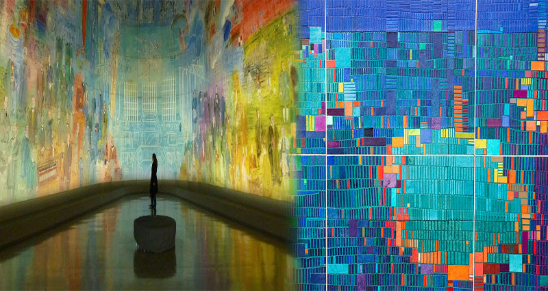
Beautiful Artwork Made Out Of Data Points
Data visualization is a field that’s gaining momentum as more companies and individuals recognize how valuable data can be. Data scientists are increasingly being tasked with creating beautiful visualizations that bring abstract datasets to life. The result is often stunning: beautiful, engaging and informative artworks made out of data points.
An explosion of beautiful data visualization
Data visualizations are becoming more common. In fact, data visualization is a growing field and it’s being used in many different industries to display all kinds of data. The following examples show how beautiful artwork can be created from complex data sets:
- The above image was created by artist [Gregor Aisch](https://www.behance.net/gregor_aisch) using real-time flight information from Twitter and Instagram posts tagged #NYCairports during Hurricane Sandy in 2012. By mapping this information onto a 3D model of JFK airport, he created an explosive representation of social media activity during one of New York City’s worst


